
When I say I’m awash in wash it means I’m concentrating on washes this past week. Inspired by a young lady I stumbled across on Instagram, Danielle Lanslots, I’ve been experimenting with some new colors and wash techniques.
Danielle pretty much works in landscapes and I LOVE her simple but striking style. I’m seeing the paintings she’s done and asking myself, “How can I adapt this type of wash to my paintings and sketches?” After watching her video about washes I made my first attempt and you can see the results on Foggy Sunrise.
Foggy Sunrise is a combination of her wash technique and a blending brush technique I learned from Steve Mitchell at the Mind of Watercolor. Once I’m a bit more comfortable with this technique I’m going to add a building on the long, hazy bits on the left side of the paper. I’m thinking an old watch tower and castle wall.
The colors I used for Foggy Sunrise were Prussian Blue, Burnt Sienna, Payne’s Gray, and Aureolen Yellow. These are all Daniel Smith Fine Watercolors.

This morning I woke up excited about doing a couple more after watching her video again last night and the first result is Misty Morning Lake. I added some birds over the lake to give the painting a bit more depth.
This painting was more in keeping with Danielle’s technique. I did add some misting with a water mister to add a bit more dimension as well as keeping the surface an paints wet. In her video she doesn’t use a mister.
Colors on this painting are combination of Qor and Daniel Smith watercolors; Nickle Azo Yellow (QoR), Phthalo Turquoise (Daniel Smith), and Permanent Alizarin Crimson (QoR).

I used the same colors to paint my next wash Sunrise on the Mountain which is for a birthday card for my wife, Ilene. Shhhhh don’t tell her as tomorrow’s her birthday and I’m hoping to slip it to her quietly.
This painting seemed to lend itself to a bit of rockiness and a feel of a mountaintop with the sun just coming up out of misty valley below. So, I added in some highlighting to give it a more rocky feel.
This painting used the same colors as the previous but I threw in some Hansa Yellow Light (Daniel Smith) for the sunrise.
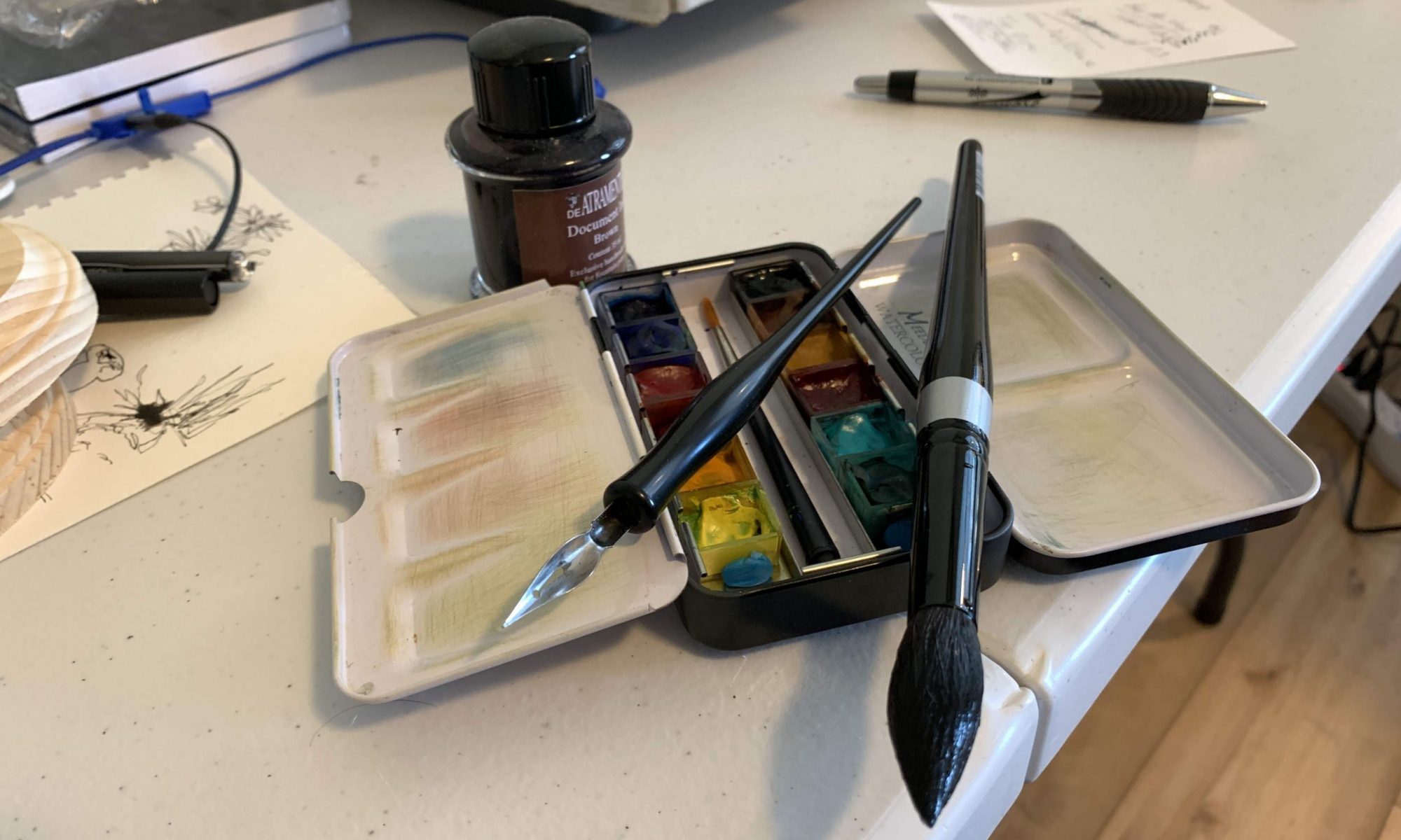
All in all I am very pleased with this technique and I’m looking forward to experimenting with different colors and perhaps adding some pen & ink to future paintings. Interestingly each of these paintings pretty much has a mind of its own and only after a couple of layers does the painting take shape.
So for the foreseeable future I’ll be pretty much awash in wash! I hope you like the paintings and enjoyed my post. Now go and make some art!